Disclaimer: This personal research note may contain errors and is provided for reference only.
Note: This note is generated based on this report deck
Global trade imbalances have returned to the center of debate in recent years. The recent meeting of G20 finance ministers and central bank governors drew intense attention, and China’s $1.2 trillion trade surplus is now widely known. According to Bessent and other macro policymakers and academics, global imbalances today have supposedly reached an all-time extreme. This narrative, amplified by outlets such as the Financial Times, has taken deep root among scholars and policymakers in many developing countries, even those within China, who follow FT, NYT, and Economist articles closely.
A $1.2 trillion trade surplus does sound enormous at first hearing. But before drawing the conclusion that global imbalances have become unsustainable, several factors need to be considered:
- If we are to discuss global imbalances, we should not look at any single country in isolation; we must first look at how the sum of all countries’ surpluses and deficits has changed over history.
- If we are to discuss the impact of imbalances on the global economy, we should look not at the absolute dollar amount of surpluses, but at their ratio to global GDP.
- If we are to identify the main contributors to imbalances, we need to see who has persistently been in imbalance and measure how large their contribution has been to the aggregated imbalance over time.
This leads us to ask:
- Is today’s global trade imbalance at an unprecedented historical peak, relative to the size of the global economy?
- Whose pattern of imbalance dynamics demonstrates a more persistent pattern, surplus countries or deficit countries?
- Has top imbalance countries’ contribution to aggregated global imbalances reached a historical peak?
To answer these questions from a sufficiently long historical perspective, this paper analyzes the Penn World Table (PWT), which provides GDP and merchandise trade data covering 1950–2023. It first computes each country’s merchandise trade balance for every year and expresses it as a ratio to global GDP. It then classifies each economy in each year into the surplus group and the deficit group, before computing the global aggregated surplus/deficits relative to global GDP.
From these calculations, this paper produces three charts and one table, and arrives at three findings:
- Relative to global output, today’s global merchandise trade imbalance is smaller than its 2005–06 peak. In other words, we are not at an unprecedented global imbalance level.
- Since the 1980s, the US has mostly been the country with the largest deficit, while the world’s largest surplus country has kept changing hands; the dynamics of the US deficit relative to global GDP demonstrate a stable and autonomous cyclical pattern, and its properties and drivers should be a primary issue when analyzing global imbalances.
- In recent years, China, the world’s largest merchandise surplus country, has indeed contributed a steadily rising share of the aggregated global surplus. However, its share remains far below the historical extreme, and is more likely a mean reversion to the dynamics in 1955–1990.
Finding 1: Currently, the Relative Scale of Global Merchandise Trade Imbalances Has Stayed Far Below Its Historical Peak in 2005-06
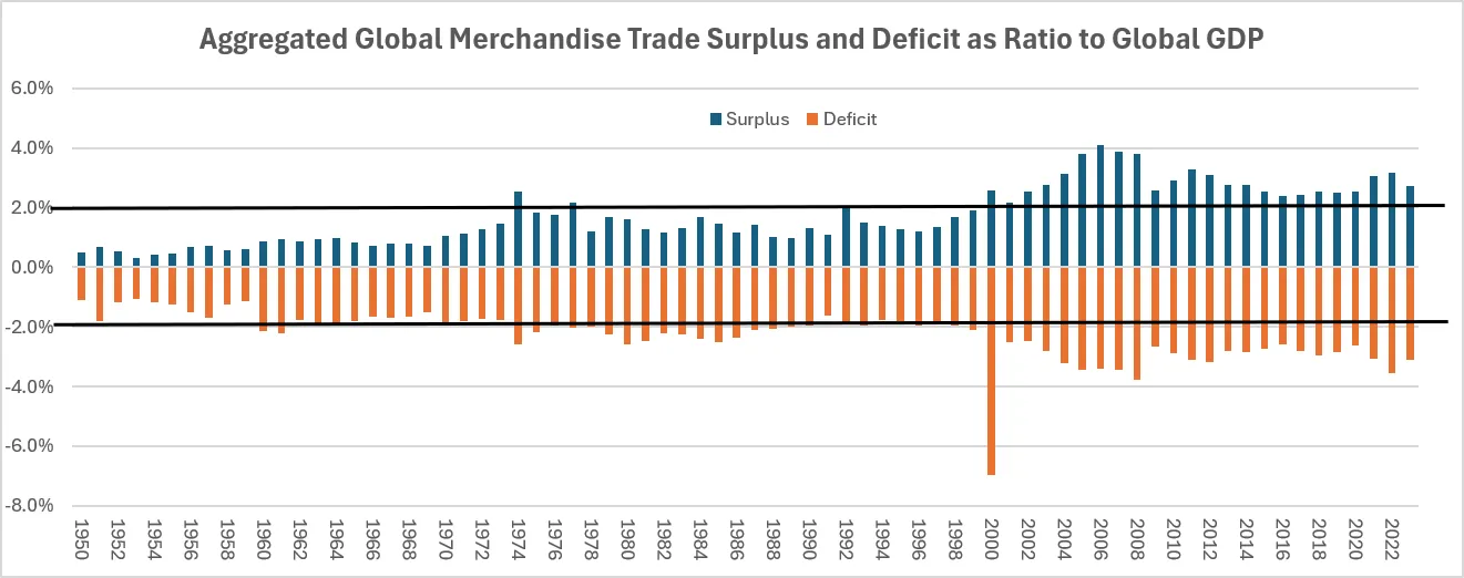
The chart below shows aggregated global surplus (blue bars) and deficit (orange bars) as shares of global GDP. (Because data for some countries are missing in the early years of the Penn World Table, the computed surplus and deficit totals differ in absolute terms.)
Figure 1. Aggregated global merchandise surplus (blue) and deficit (orange) as a share of global GDP, 1950–2023.
Three phases stand out:
- 1950–1970: total surplus stayed below 1% of global GDP, and total deficit below 2%;
- 1970–2000: total surplus fluctuated around 1.8% of global GDP, and total deficit around 2%;
- 2000–present: both surplus and deficit have remained above 2%, peaking in 2005–06 at around 4%, before drifting lower amid fluctuations.
The claim that the current global imbalances have reached an all-time extreme therefore does not hold up.
Finding 2: A Stable Largest Deficit Country (the US since 1983) and a Rotating Largest Surplus Country
The table below maps the largest surplus country and the largest deficit country in each period since 1950 (in the Penn World Table 11, Germany is the sum of East and West Germany):
Table 1. The largest surplus country and the largest deficit country by year, 1950–2023 (upper panel) and 1983–2023 (lower panel).


- In the 1950s, the United States was the world’s largest surplus country; in the 1960s and 1970s, Iran and Saudi Arabia took that position.
- Since the early 1980s, the United States has been the largest deficit country in almost every year, while the largest surplus country has rotated through Japan (1980s–1990s), Russia (around 2000), Saudi Arabia (2011–2012), and China (after 2012).
The chart below shows the trade balances of the US (green bars), China (blue bars), and “Japan + Germany” (orange bars), further illustrating the pattern of a stable deficit country and rotating surplus countries:
Figure 2. Trade balances of the US (green), China (blue), and Japan + Germany (orange) as a ratio to global GDP, 1950–2023.
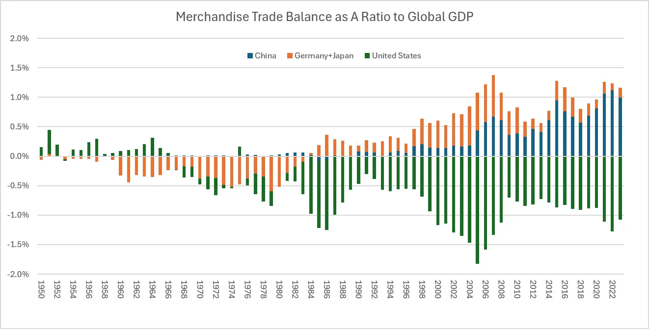
- Since the 1980s, the US merchandise trade deficit has fluctuated cyclically around 1% of global GDP. Its current size is similar to the level around 1985, and below the 2005 peak.
- Since entering the 21st century, the US imbalance shows no systematic correlation with the size of China’s surplus: when the US imbalance peaked in 2005, China’s surplus was less than one-third of the combined surplus of Japan and Germany, and rising only modestly; in 2005–2008, China’s surplus expanded steadily while the US deficit narrowed rapidly; in 2015–2018, China’s surplus declined steadily while the US deficit widened at the margin.
In short, the US imbalance seems to demonstrate autonomous dynamics. Analyzing the properties and drivers of this stable pattern is a primary issue when studying global imbalance issues.
Finding 3: The Largest Surplus Country’s Rising Contribution in Recent Years Looks More Like Mean Reversion
The chart below shows, for each year since 1950, the largest surplus country’s surplus as a share of the aggregated global surplus (blue line), and the largest deficit country’s deficit as a share of the aggregated global deficit (orange line):
Figure 3. Contribution to imbalances from the largest surplus country (blue) and the largest deficit country (orange), 1950–2023.
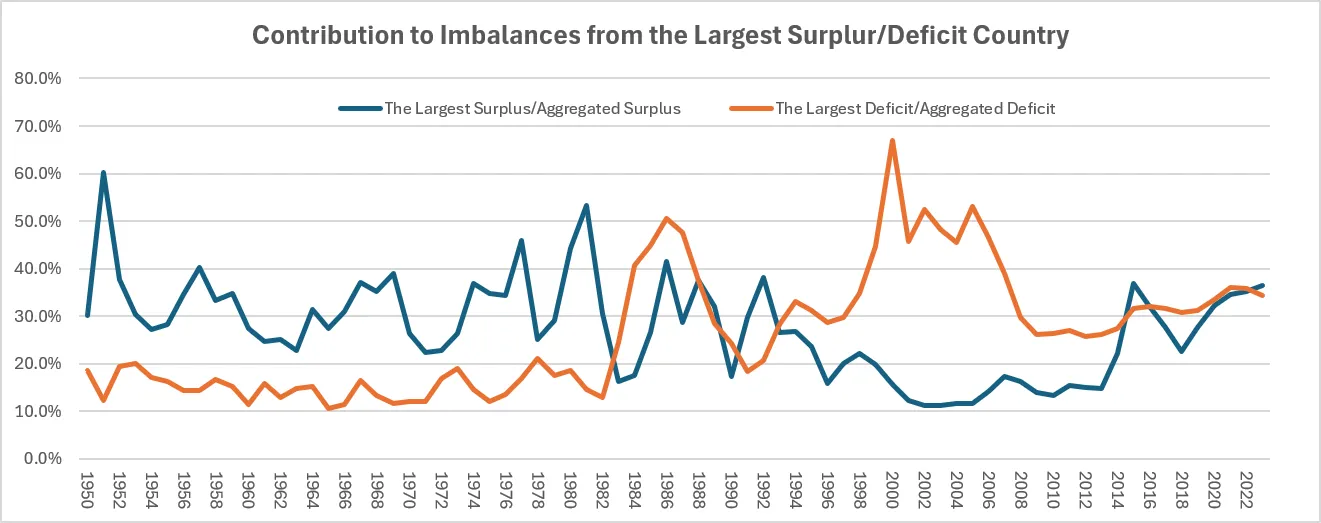
- Since 2012, when China became the world’s largest surplus country, the largest surplus country’s contribution to the global surplus total has indeed increased. However, viewed over the long run from 1950 to today, this rise looks more like mean reversion to a historical norm: the current contribution of about 35% is comparable to the average of 1955–1990. By contrast, the trend of 2000–2010 appears to be the historical outlier.
- On the deficit side, the US contribution to the global deficit has edged up over the past decade. Although lower than in the first decade of the 21st century, the current contribution of about 35% is clearly elevated compared with 1950–1980, the period before the US became the persistent largest deficit country.
